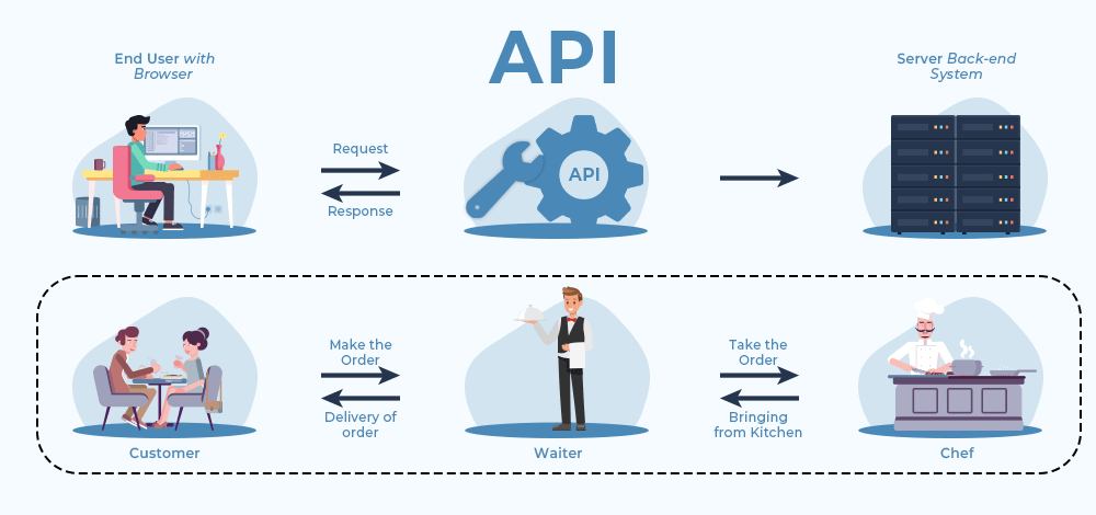
Your website is your digital storefront—and let’s face it, you’ve only got a few seconds to make a great first impression. In fact, 94% of first impressions are based on design.
Whether you’re building a brand-new site or giving your current one a makeover, it’s easy to fall into common design traps that turn visitors away instead of drawing them in. Based on personal experience and research, I’ve compiled the most frequent website design mistakes—and how to fix them so your site works smarter, not harder.
Let’s dive in.
1. Your Website Loads Like It’s 2005
Nobody likes to wait. If your website takes too long to load, your visitors are already hitting the back button.
Why it happens:
- Oversized images
- Unoptimized code
- Too many third-party plug-ins
Fix it:
- Compress your images (use WebP or tools like TinyPNG)
- Minify JavaScript and CSS
- Use tools like Google PageSpeed Insights to run a performance check
👉 Faster loading = happier visitors + better SEO + lower bounce rates.
2. It’s Not Mobile-Friendly
Over half of your traffic is probably coming from mobile devices. If your site doesn’t adjust to different screen sizes, you’re missing out—big time.
Fix it:
- Use responsive design techniques
- Test on multiple devices
- Prioritize mobile usability in your layout and navigation
Your users shouldn’t need two fingers and a magnifying glass to navigate your site.
3. Your CTAs Are… Meh
If your call-to-action says something like “Click Here” or “Learn More,” you’re losing conversions. People need clarity and direction.
Fix it:
- Be specific: “Download My Free Guide,” “Book a Demo,” or “Get 10% Off Now”
- Make your CTAs stand out visually
- Place them where users naturally scroll
A good CTA doesn’t just ask—it motivates.
❓ Mistake #4: Your Message Isn’t Clear
Ever landed on a website and thought, “Wait, what do these people even do?” That’s what vague messaging does.
Fix it:
- State your value proposition clearly—and do it above the fold
- Keep language simple and benefit-driven
- Don’t bury important information under jargon
Your website should answer “Why should I care?” within 5 seconds.
5. The Design Feels Cluttered
When everything is screaming for attention, nothing stands out. A messy, overloaded layout overwhelms visitors and makes navigation harder.
Fix it:
- Use white space strategically
- Stick to a simple color palette and font system
- Focus each page on one primary goal
A clean design makes a strong, professional impression.
6. There’s Just Too Much Text
No one wants to read a novel when visiting a website. Large, uninterrupted blocks of text are a huge turn-off.
Fix it:
- Use short paragraphs and bullet points
- Break up content with images and headings
- Highlight key information visually
Think “skim-friendly,” not “term paper.”
7. You Don’t Know Who You’re Designing For
If you’re not designing for a specific audience, you’re designing for no one. Your message will fall flat if it doesn’t resonate.
Fix it:
- Define your audience using personas
- Use language, visuals, and content tailored to their needs
- Anticipate their problems and provide solutions quickly
8. Navigation is Hard to Find
If users can’t find your navigation bar or get back to the homepage easily, they’ll leave out of frustration.
Fix it:
- Make your menu visible and consistent
- Add a sticky header that follows users as they scroll
- Use clear labels like “Services,” “Contact,” and “Pricing”
Make exploring your site intuitive—not a scavenger hunt.
9. Boring or Broken 404 Pages
A generic “Page Not Found” message is a missed opportunity to engage. Worse, it can make your site feel broken.
Fix it:
- Customize your 404 page with friendly copy and helpful links
- Include a search bar or suggest popular pages
- Keep it on-brand and playful if appropriate
A good 404 page keeps the user journey going instead of cutting it off.
10. Tiny, Hard-to-Read Fonts
Your content might be gold, but if people can’t read it easily, they won’t stick around.
Fix it:
- Use font sizes of at least 16px for body text
- Choose clean, web-safe fonts with good contrast
- Make sure your text looks good on all devices
If users are zooming in to read, it’s time for a typography tune-up.
Final Thoughts
Designing a high-performing website doesn’t require being flashy—it requires being thoughtful. A site that loads fast, speaks clearly, and guides users effortlessly is more than just a digital presence—it’s a business tool that converts.
Start with the basics:
✅ Speed matters.
✅ Clarity matters.
✅ Your audience matters.
🎯 Want to turn visitors into paying customers? Focus on creating a site that works for them—and the results will follow.
Need help improving your website design?
Let’s chat! Book a free strategy call and discover how we can boost your website’s performance, design, and conversions.